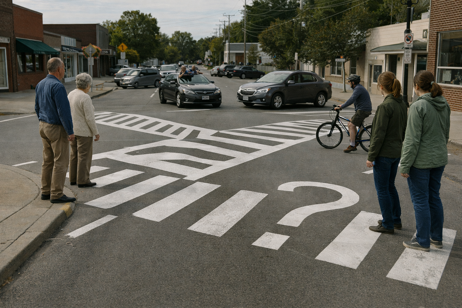
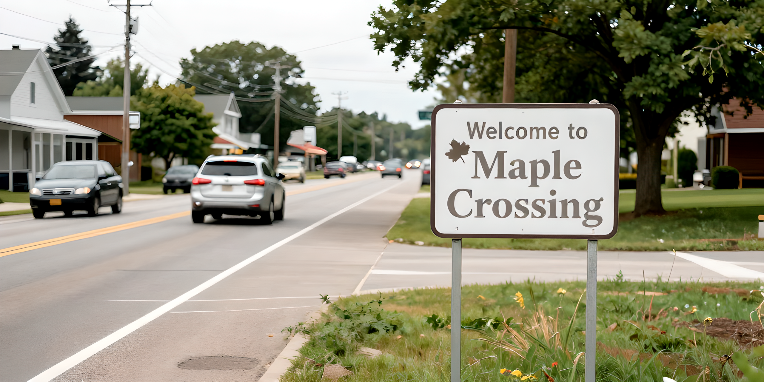
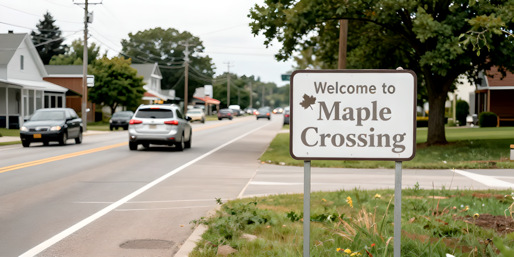
After six months of planning, two committee name changes, and one very focused debate about font choice, Maple Crossing officially unveiled its new “Welcome” sign on Main Street last Friday. By Monday morning, residents had already adapted by not seeing it at all.
The sign, positioned prominently at the town’s eastern entrance, features the town name in tasteful lettering, a subtle graphic of a maple leaf, and the slogan “A Nice Place to Be From.” It replaces the previous sign, which residents recall fondly as “the old one” and vaguely remember being there “forever.”
Mayor Linda Schroepfer called the unveiling “a proud moment.”
“This sign tells people who we are,” she said, standing directly in front of it while several cars drove past without slowing. “It says welcome, but not aggressively.”
Early reactions were strong but brief. Several residents reported noticing the sign over the weekend, mostly while asking themselves if it had always been there. By Monday, that awareness had faded.
“I saw it on Friday and thought, ‘Huh,’” said local mechanic Tom Alvarez. “Today I only remembered it existed because you asked.”
The sign cost $14,000, a figure officials insist reflects durability, weather resistance, and a finish described as “confident but humble.” According to Town Hall, the sign should last at least 25 years, or until it becomes invisible through familiarity, whichever comes first.
The Beautification Committee is already considering next steps, including seasonal wreaths, a small plaque explaining the sign, or possibly a second sign reminding residents to notice the first one.
As of press time, the sign remains clean, legible, and fully ignored — a seamless addition to Maple Crossing’s landscape.